Flexbox ?
Flexbox is a one-dimensional layout method whose arrange to items in rows or columns.

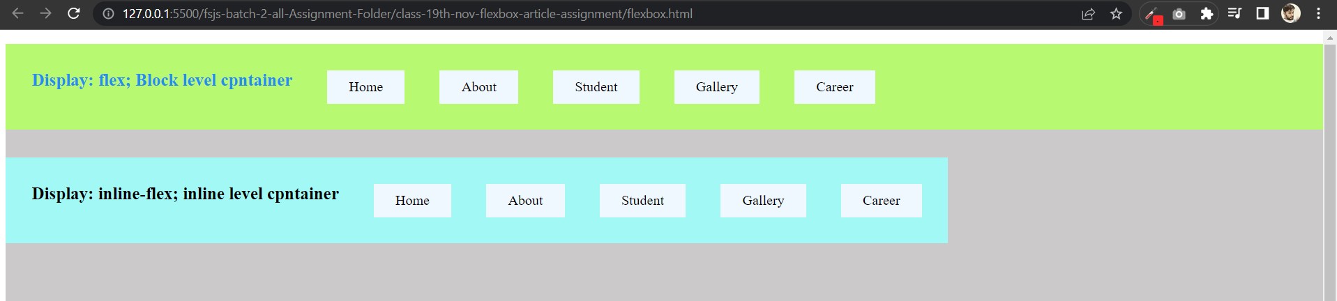
Flexbox is a one-dimensional layout method whose arrange to items in rows or columns. Flex item always start Left to Right (default ).Display: flex; is a block level container and Display: inline-flex; is a inline level container.
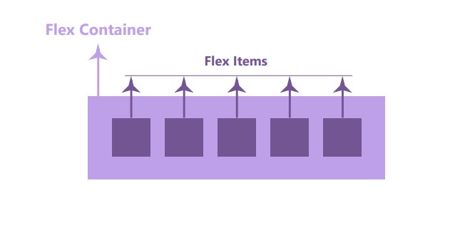
When we use display flex in css declaration to targeting container by css selector, so this display flex property change those container behaviour and convert to those container into flex-container.
- So when we use property
display: flex;, here two word comes one isflex-containerand second isflex-item.
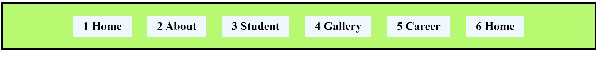
display: flex;When we gave display flex property to any container they leave default column behaviour and set in rows all container's items.HTML Code:
<body>
    <nav>
      <ul>
        <li>Home</li>
        <li>About</li>
        <li>Student</li>
        <li>Gallery</li>
        <li>Career</li>
      </ul>
    </nav>
  </body>
- CSS Code:
 <style>
      nav {
        background-color: #cbc9c9;
        width: 100vw;
        height: 100vh;
      }
   /* Flex Container => Parent */
      ul {
        /* display: flex; */
      }

 /* Flex Item => Children */
      li {
        background-color: aliceblue;
        padding: 10px 25px;
      }
    </style>
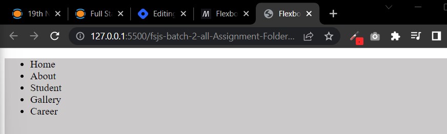
- Default Output:
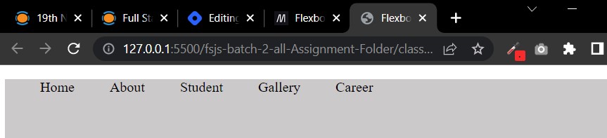
Using Property
display: flex;HTML code will be same.
-CSS Code:
  <style>
      nav {
        background-color: #cbc9c9;
        width: 100vw;
        height: 100vh;
      }
      /* Flex Container => Parent */
      ul {
        display: flex;

        column-gap: 40px;
        list-style: none;
      }

      /* Flex Item => Children */
      li {
        background-color: aliceblue;
        padding: 10px 25px;
      }
    </style>
- Flexbox Property Output:
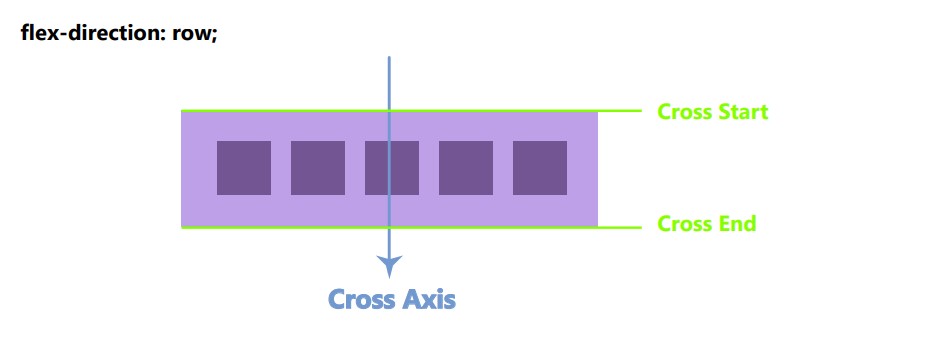
Flexbox Axis:
Flexbox have two axis one is called Main Axis and second is Cross Axis. Flexbox is always worked with Main axis.
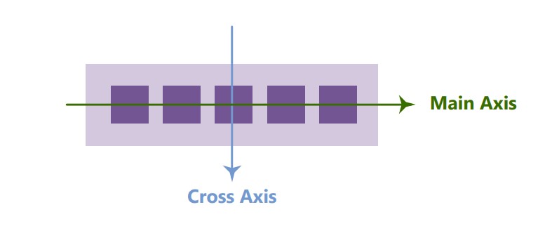
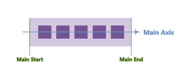
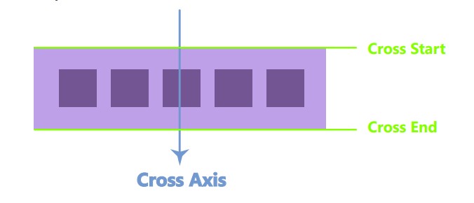
Main axis and cross axis have two things one is Start and second is End.
- So here have in main axis two things
Main StartandMain End.
- And cross axis have two things
Cross StartandCross End.
So here we use flexbox property for two things:
We use flex property for
flex-containerandflex-item.
Flexbox Property for Flex-Container:
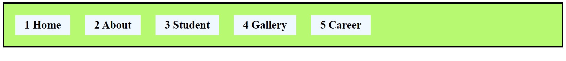
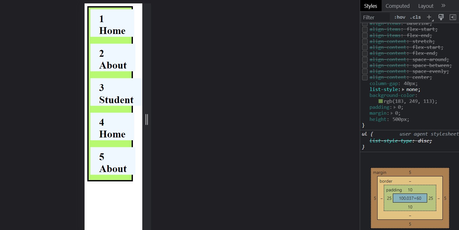
###Flex-Direction Property:
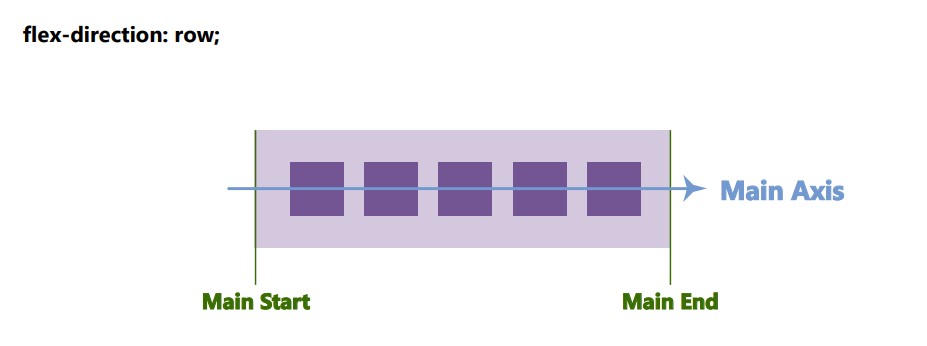
Flex direction declare the container axis, Axis are two type horizontal and vertical. Flex dirction property have four value
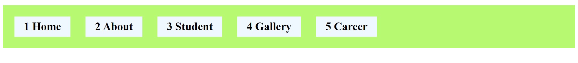
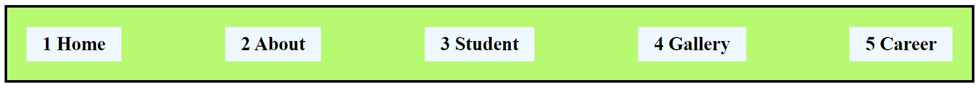
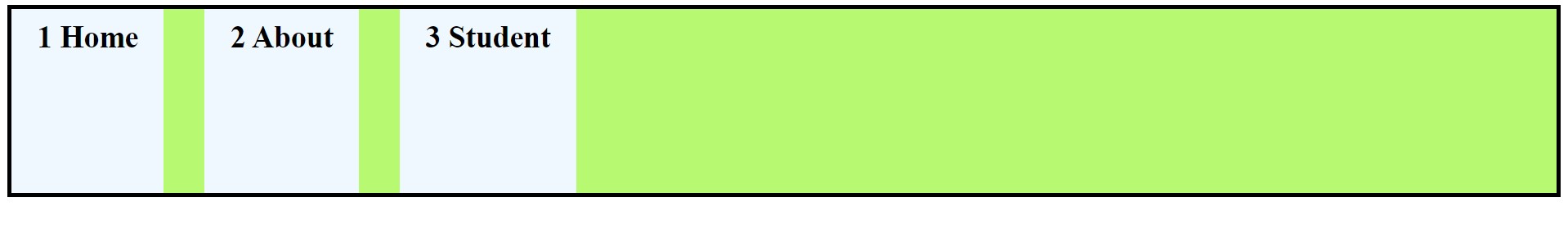
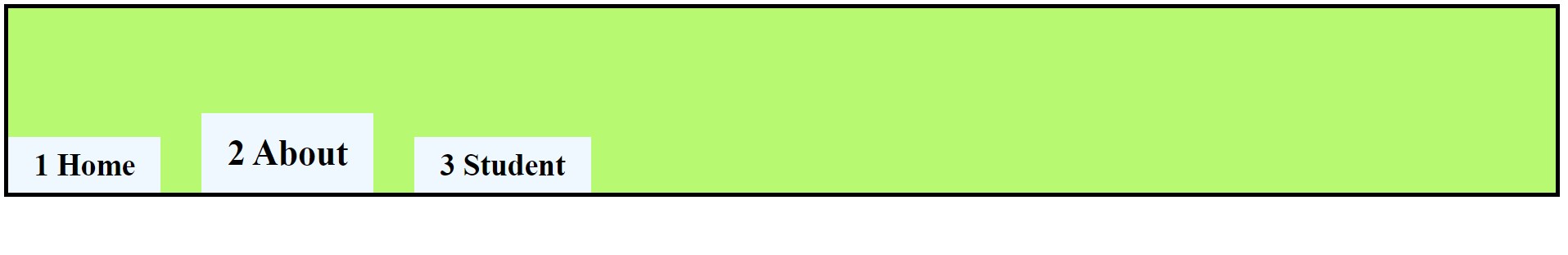
column,row,column-reverseandrow-reverse,.flex-direction: row;: Row will start always left to right because our main axis go always left to right.
<style>
      /* Flex Container => Parent */
      ul {
        display: flex; /* blcok level container*/

        /* flex direction property */
        flex-direction: row; /* value- row */

        column-gap: 40px;
        list-style: none;
        background-color: rgb(183, 249, 113);
        padding: 30px;
      }

      /* Flex Item => Children */
      li {
        background-color: aliceblue;
        padding: 10px 25px;
      }
    </style>
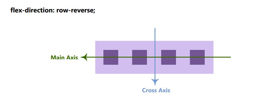
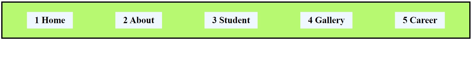
flex-direction: row-reverse;: Reverse the main axis (right to left) and cross axis will same (top to bottom).
<style>
      /* Flex Container => Parent */
      ul {
        display: flex; /* blcok level container*/

        /* flex direction property */
        /* flex-direction: row;  */
        flex-direction: row-reverse;

        /* flex-direction: column; */

        column-gap: 40px;
        list-style: none;
        background-color: rgb(183, 249, 113);
        padding: 30px;
      }

      /* Flex Item => Children */
      li {
        background-color: aliceblue;
        padding: 10px 25px;
      }
    </style>

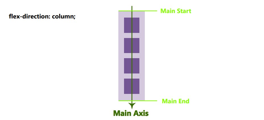
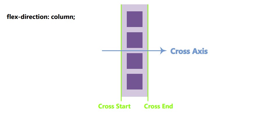
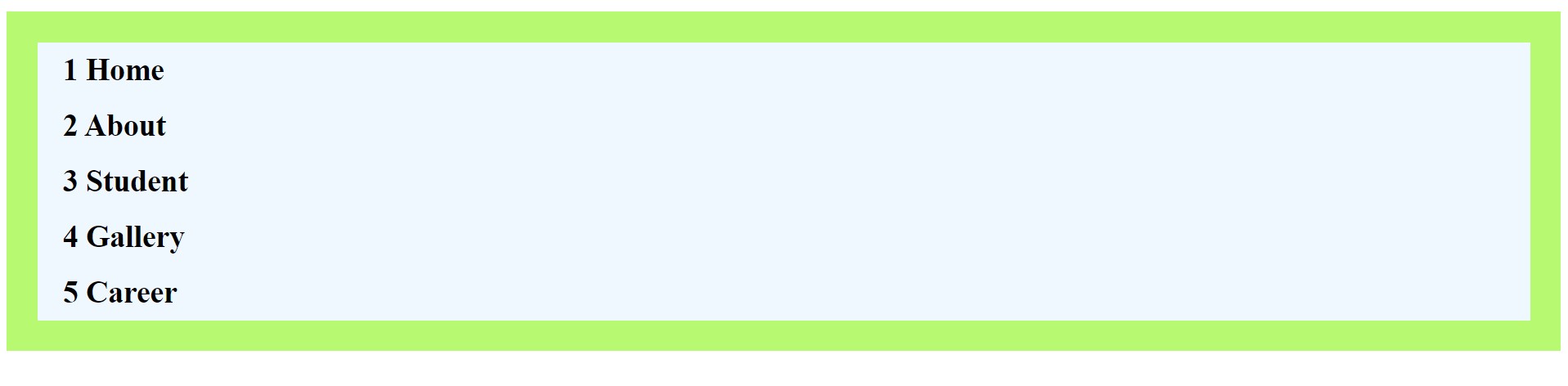
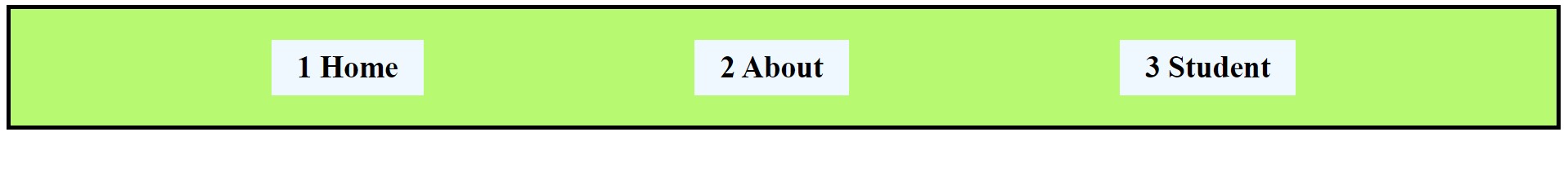
flex-direction: column;: Our main axis will turn top to bottom and cross axis will be left to right .
<style>
      /* Flex Container => Parent */
      ul {
        display: flex; /* blcok level container*/

        /* flex direction property */
        flex-direction: column; /* value- column */

        column-gap: 40px;
        list-style: none;
        background-color: rgb(183, 249, 113);
        padding: 30px;
      }

      /* Flex Item => Children */
      li {
        background-color: aliceblue;
        padding: 10px 25px;
      }
    </style>
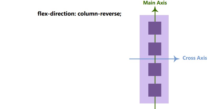
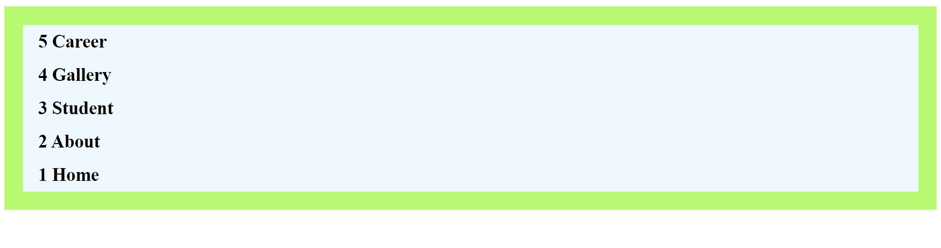
flex-direction: column-reverse;: Main axis will start bottom to top and cross axis will be left to right.
<style>
      /* Flex Container => Parent */
      ul {
        display: flex; /* blcok level container*/

        flex-direction: column-reverse;

        column-gap: 40px;
        list-style: none;
        background-color: rgb(183, 249, 113);
        padding: 30px;
      }

      /* Flex Item => Children */
      li {
        background-color: aliceblue;
        padding: 10px 25px;
        font-size: 30px;
        font-weight: 800;
      }
    </style>
Flex-Wrap Property:
When flex items breaking the flex container means when overflowing the items where we usewrapproperty. This flex wrap property will start new line to the overflowing items.
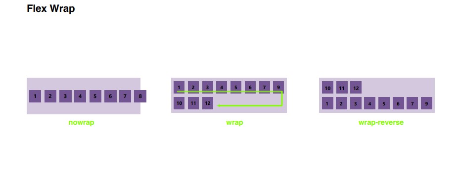
- To avoid this situation(overflow) we use
flex-wrapproperty.
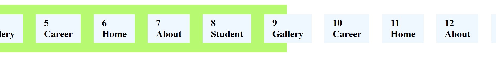
flex-wrap: wrap;:-
<style>
      /* Flex Container => Parent */
      ul {
        display: flex; /* blcok level container*/

        flex-wrap: wrap;

        column-gap: 40px;
        list-style: none;
        background-color: rgb(183, 249, 113);
        padding: 30px;
      }

      /* Flex Item => Children */
      li {
        background-color: aliceblue;
        padding: 10px 25px;
        font-size: 30px;
        font-weight: 800;
      }
    </style>
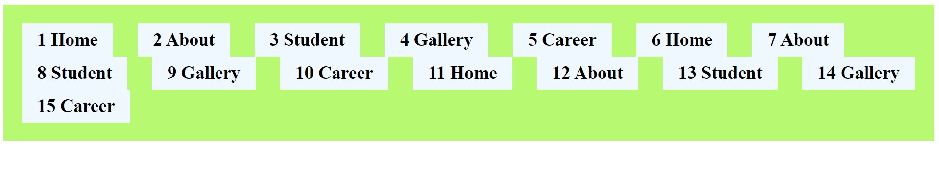
Flex-Flow Property:
Flex flow is a shorthand property of flex-direction and flex-wrap. We can write inside flex-flow, both property .
<style>
      /* Flex Container => Parent */
      ul {
        display: flex; /* blcok level container*/


        /* flex-direction: row; */
        /* flex-wrap: wrap; */
        /* Shorthand property */
        flex-flow: row wrap;

        column-gap: 40px;
        list-style: none;
        background-color: rgb(183, 249, 113);
        padding: 30px;
      }

      /* Flex Item => Children */
      li {
        background-color: aliceblue;
        padding: 10px 25px;
        font-size: 30px;
        font-weight: 800;
      }
    </style>
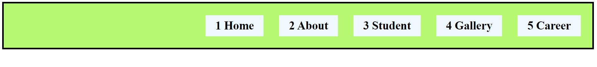
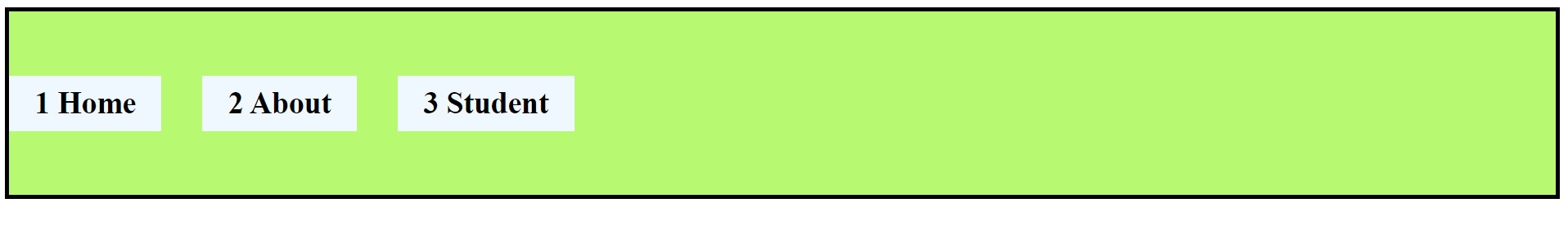
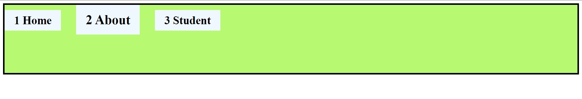
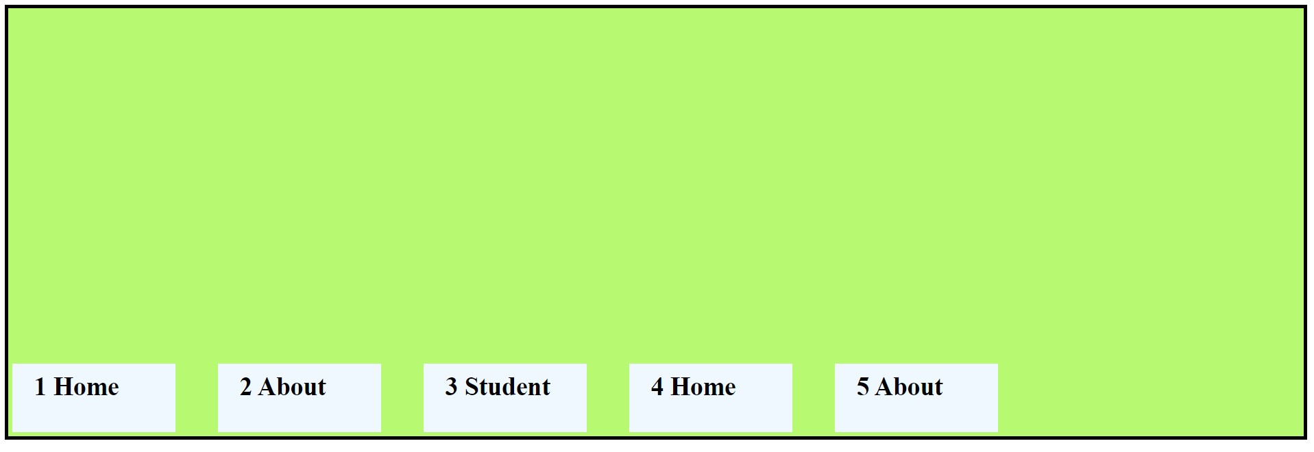
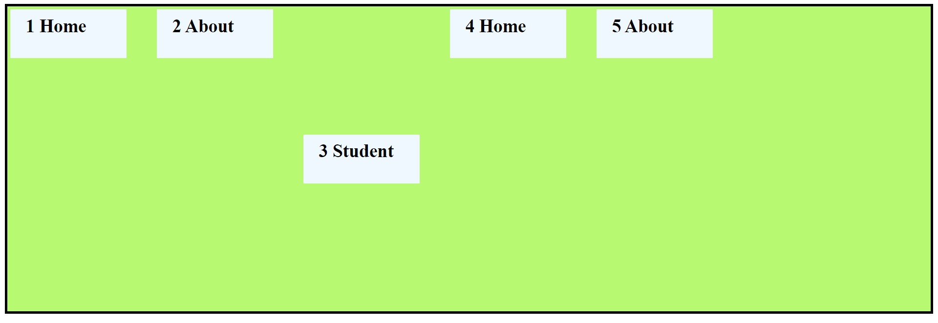
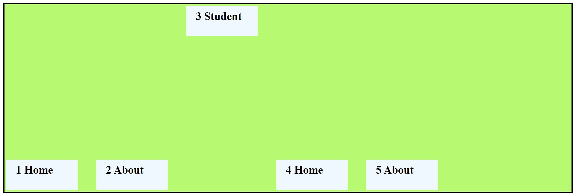
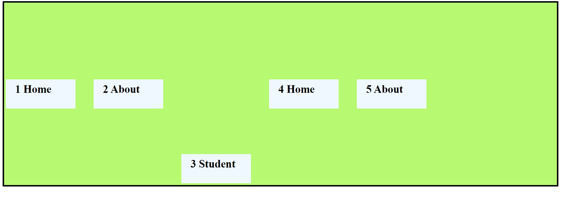
Justify-Content Property:
Justify content declare where the flex-items sit on the main axis and giving space between and among of flex items. For flex box justify-content have six value.flex-start,flex-end,center,space-between,space-around,space-evenly.
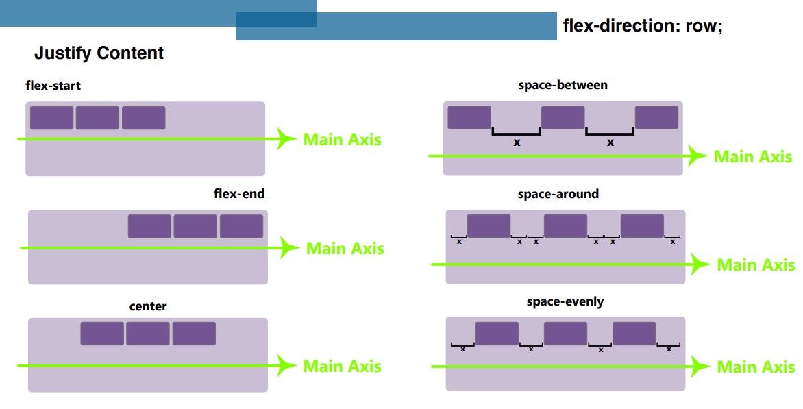
justify-content: center;:- This property will seated flex items on center of themain axis.<style> nav { border: 4px solid black; } /* Flex Container => Parent */ ul { display: flex; /* blcok level container*/ /* flex direction property */ /* flex-direction: row; */ /* flex-direction: row-reverse; */ /* flex-direction: column; */ /* flex-direction: column-reverse; */ /* flex-wrap: wrap; */ /* Shorthand property */ /* flex-flow: row wrap; */ justify-content: center; /* justify-content: flex-start; */ /* justify-content: flex-end; */ /* justify-content: space-between; */ /* justify-content: space-around; */ /* justify-content: space-evenly; */ column-gap: 40px; list-style: none; background-color: rgb(183, 249, 113); padding: 30px; margin: 0; } /* Flex Item => Children */ li { background-color: aliceblue; padding: 10px 25px; font-size: 30px; font-weight: 800; } </style>
flex-start:
flex-end:
space-between:
space-around:
space-evenly:
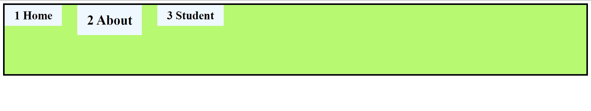
Align-Items Property: Align items property work on cross axis so to set the flex items on
cross-axis. Align-items property have some value ex.stretch,flex-start,flex-end,baseline.
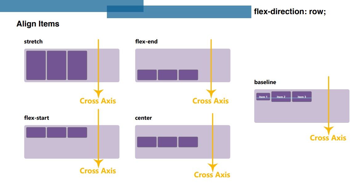
align-items: stretch;:- This value stretch to the flex-items width of flex-container.
    <style>
      nav {
        border: 4px solid black;
      }
      /* Flex Container => Parent */
      ul {
        display: flex; /* blcok level container*/

        align-items: stretch;
        /* align-items: center;
        align-items: baseline;
        align-items: flex-start;
        align-items: flex-end; */

        column-gap: 40px;
        list-style: none;
        background-color: rgb(183, 249, 113);
        padding: 0;
        margin: 0;
        height: 180px;
      }
    </style>
align-items: center;:-
align-items: baseline;:-
    <style>
      nav {
        border: 4px solid black;
      }
      /* Flex Container => Parent */
      ul {
        display: flex; /* blcok level container*/

        /* align-items: stretch; */
        /* align-items: center; */
            align-items: baseline;
        /* align-items: flex-start; */
        /*align-items: flex-end;*/

        column-gap: 40px;
        list-style: none;
        background-color: rgb(183, 249, 113);
        padding: 0;
        margin: 0;
        height: 180px;
      }

      /* Flex Item => Children */
      li {
        background-color: aliceblue;
        padding: 10px 25px;
        font-size: 30px;
        font-weight: 800;
      }
      li:nth-child(2) {
        background-color: aliceblue;
        padding: 19px 25px;
        font-size: 35px;
        font-weight: 900;
      }
    </style>
align-items: flex-start;:-
align-items: flex-end;:-
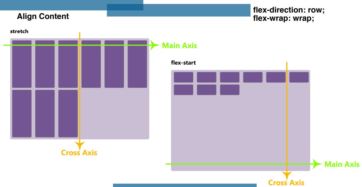
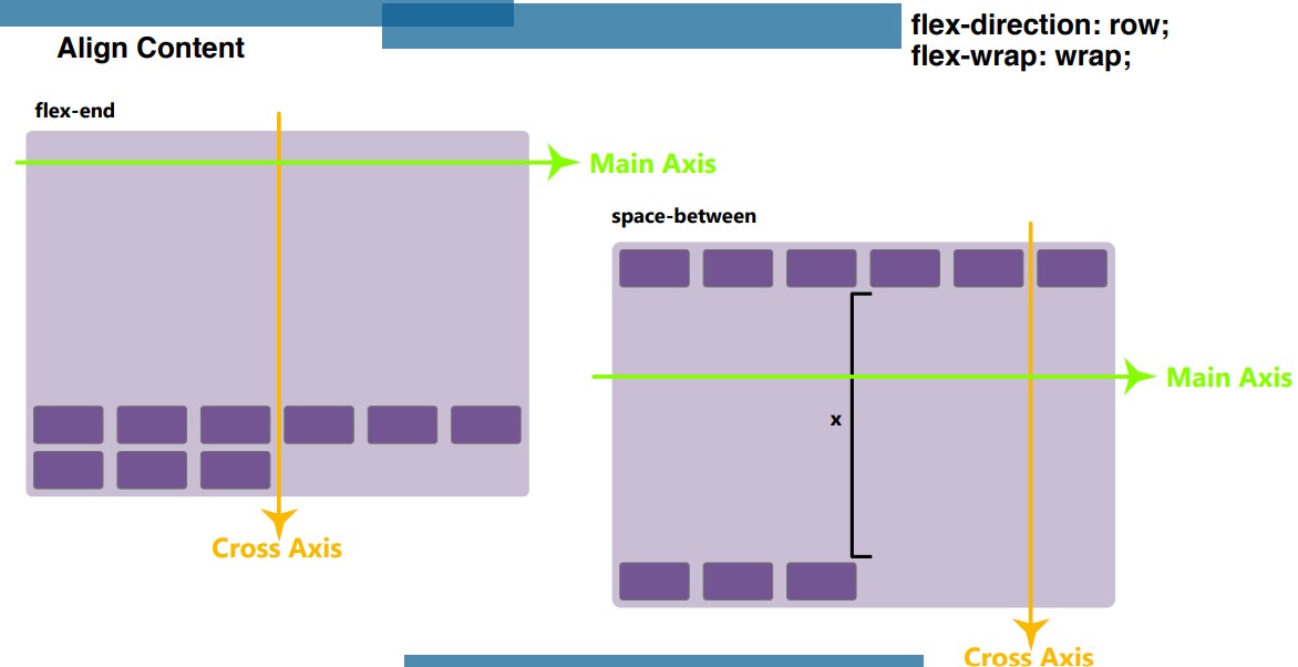
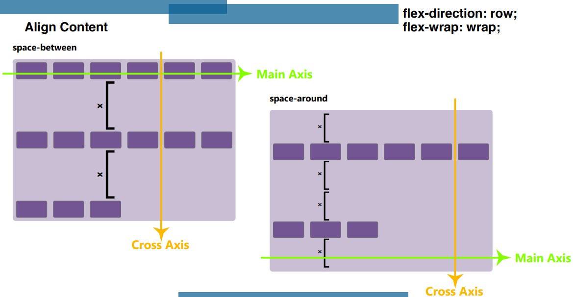
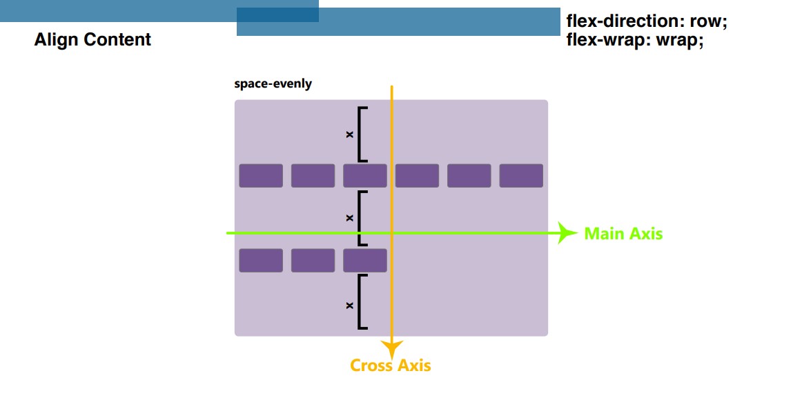
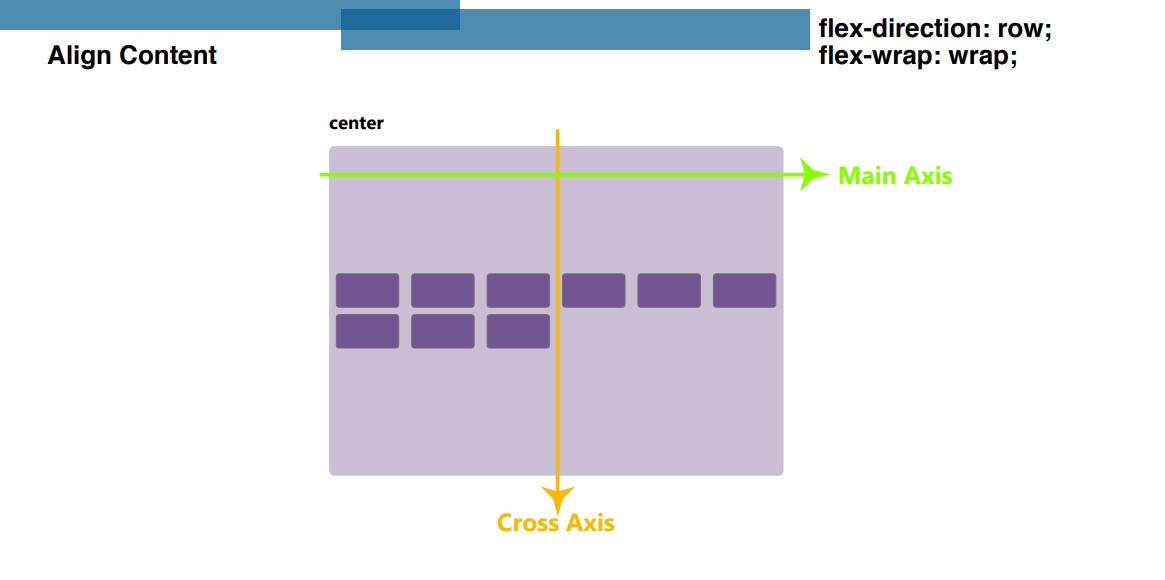
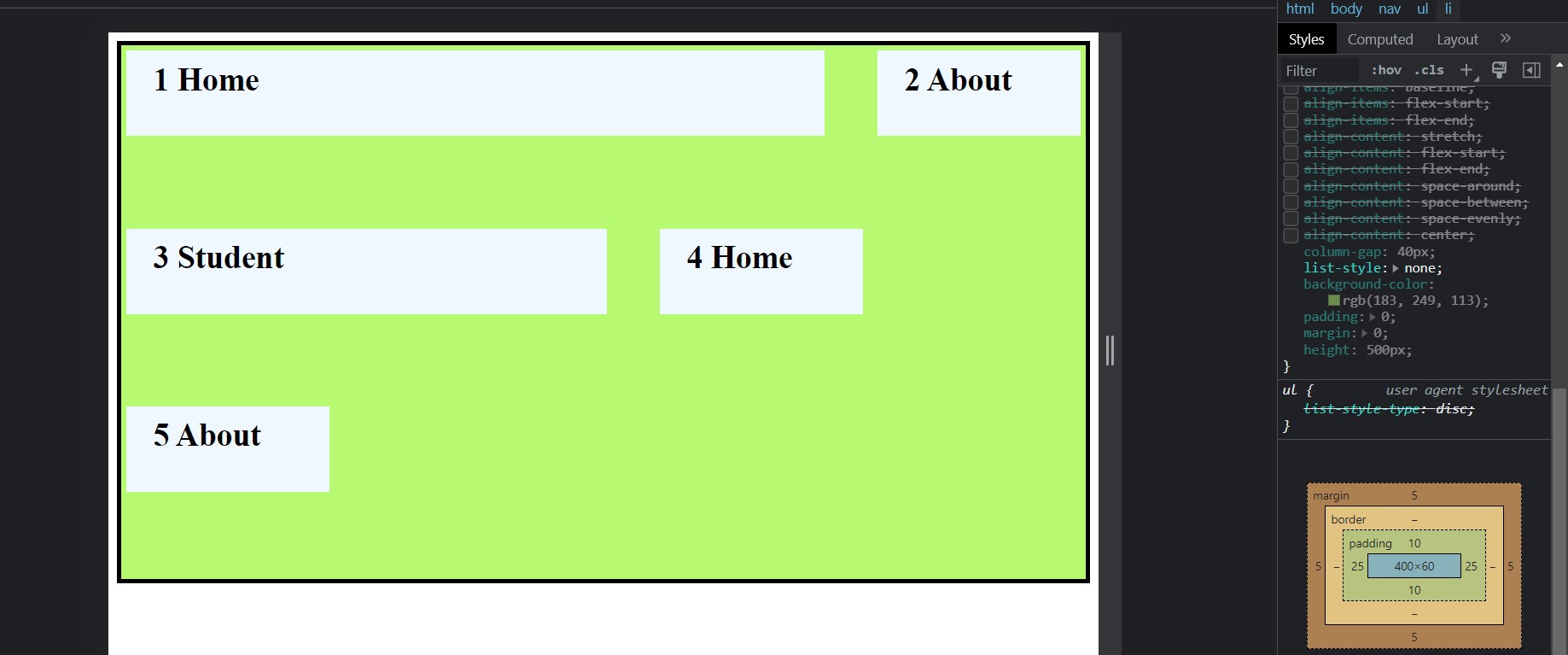
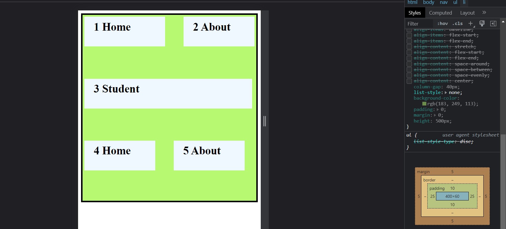
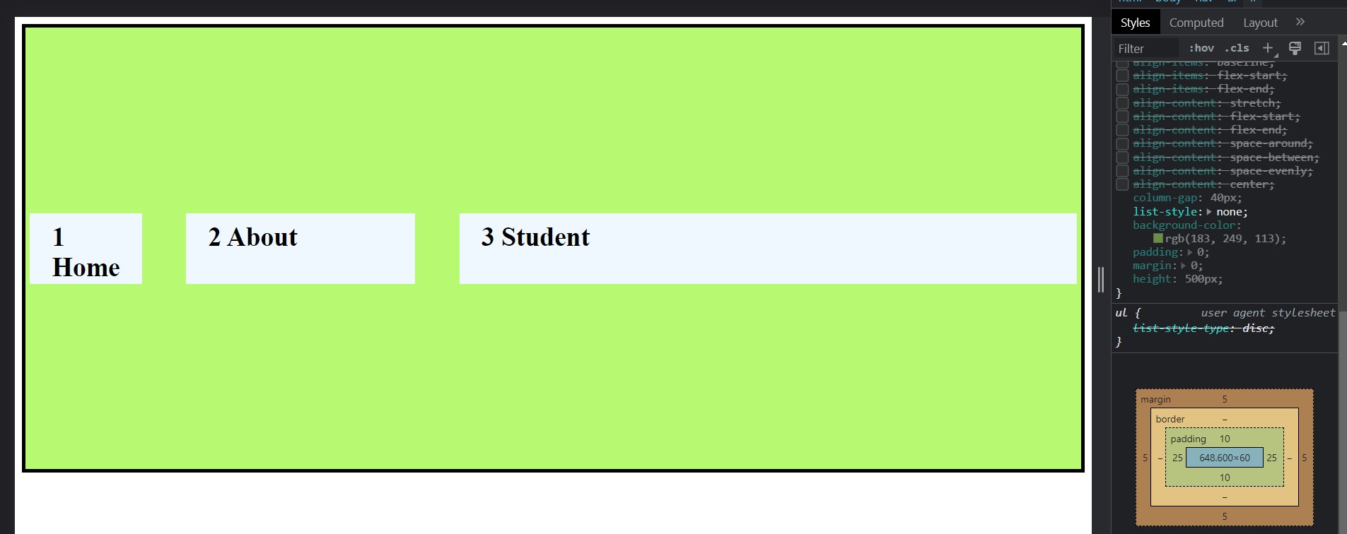
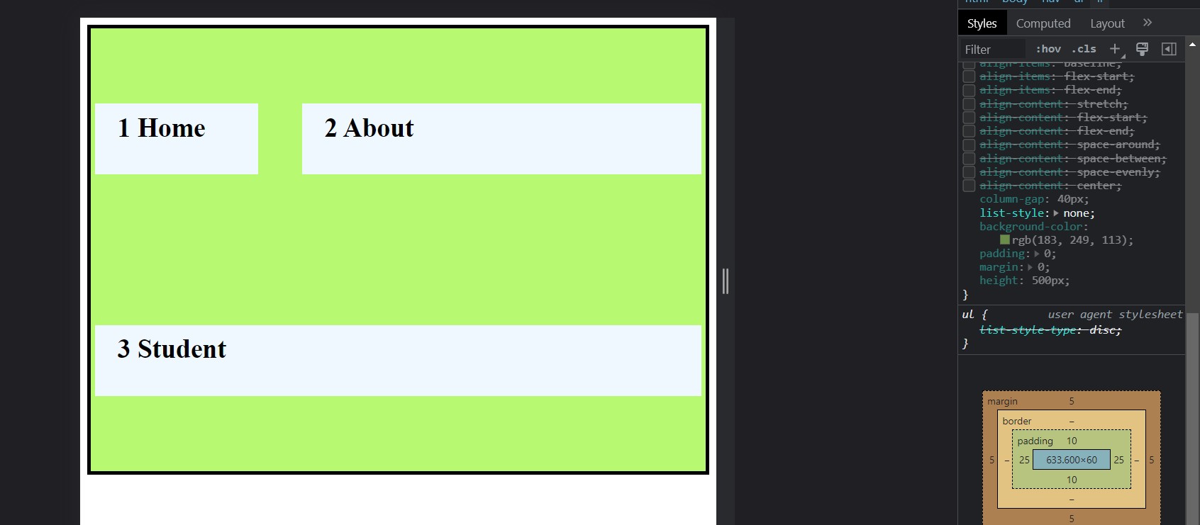
Align-Content Property:
Align content property to set the flex items on cross-axis and giving between and around space. When we not use flex-wrap property then till not function align content property. This property have also values stretch, flex-start, flex-end, center, space-between, space-around, space-evenly.
  <style>
      nav {
        border: 4px solid black;
      }
      /* Flex Container => Parent */
      ul {
        display: flex; /* blcok level container*/

        flex-direction: row;
        flex-wrap: wrap;

        /* align-content: stretch; */
        /* align-content: flex-start; */
        /* align-content: flex-end; */
        /* align-content: space-around; */
        /* align-content: space-between; */
        /* align-content: space-evenly; */
        align-content: center;

        column-gap: 40px;
        list-style: none;
        background-color: rgb(183, 249, 113);
        padding: 0;
        margin: 0;
        height: 500px;
      }

      /* Flex Item => Children */
      li {
        background-color: aliceblue;
        padding: 10px 25px;
        font-size: 30px;
        font-weight: 800;
        width: 140px;
        height: 60px;
        margin: 5px;
      }
    </style>
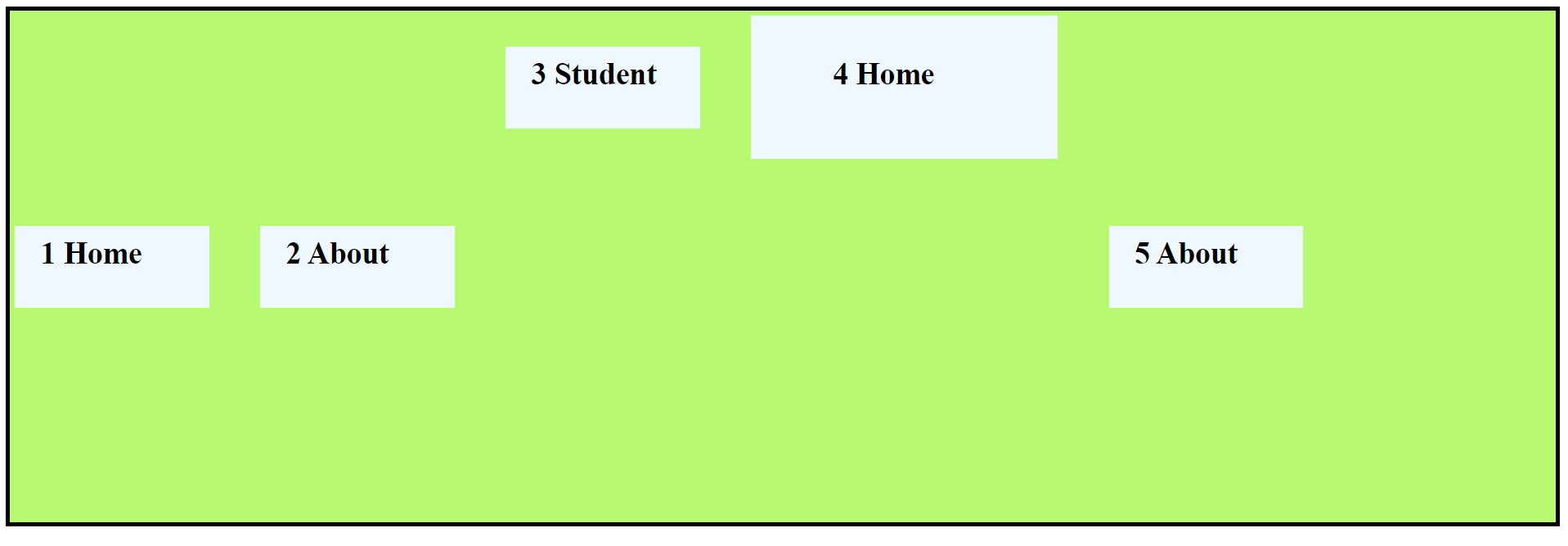
Flexbox Property for Flex-Items:
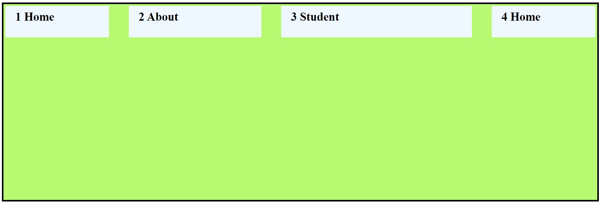
Order Property:
This property is use for flex items. This is seperately giving order to flex-items. Default order value is zero, this order property urjest items in ascending order. This order property is used for giving and set in new position.
  <style>
      nav {
        border: 4px solid black;
      }
      /* Flex Container => Parent */
      ul {
        display: flex; /* blcok level container*/


        column-gap: 40px;
        list-style: none;
        background-color: rgb(183, 249, 113);
        padding: 0;
        margin: 0;
        height: 500px;
      }

      /* Flex Item => Children */
      li {
        background-color: aliceblue;
        padding: 10px 25px;
        font-size: 30px;
        font-weight: 800;
        width: 140px;
        height: 60px;
        margin: 5px;
      }

      li:nth-child(3) {
        order: 0;
      }
      li:nth-child(4) {
        order: 1;
      }
      li:nth-child(5) {
        order: 2;
      }
      li:nth-child(1) {
        order: 3;
      }
      li:nth-child(2) {
        order: 4;
      }
    </style>
Flex-Grow Property:
This flex grow property work on flex items and initial value of flex grow is zero, if we gave same value to flex item then all flex item get same ratio available of flex container remaining space. If all flex grow value gave different then items are divided of the available flex container space ratio.
    <style>
      nav {
        border: 4px solid black;
      }
      /* Flex Container => Parent */
      ul {
        display: flex; /* blcok level container*/

        column-gap: 40px;
        list-style: none;
        background-color: rgb(183, 249, 113);
        padding: 0;
        margin: 0;
        height: 500px;
      }

      /* Flex Item => Children */
      li {
        background-color: aliceblue;
        padding: 10px 25px;
        font-size: 30px;
        font-weight: 800;
        width: 140px;
        height: 60px;
        margin: 5px;
      }


      /* flex grow property */
      li:nth-child(1) {
        flex-grow: 1;
      }
      li:nth-child(2) {
        flex-grow: 2;
      }
      li:nth-child(3) {
        flex-grow: 4;
      }
      li:nth-child(4) {
        flex-grow: 1;
      }
    </style>
Flex-Shrink Property:
Flex shrink property will also apply on flex items, flex shrink gave the shrink factor to flex item and they shrink according to the flex container. The flex-shrink property is specified as a single <number> and initial vale is one.
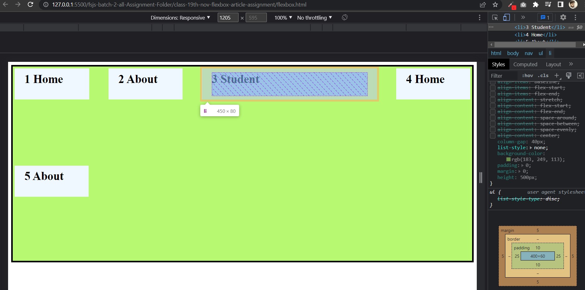
Flex-Basis Property:
The flex basis css property sets the initial limit of flex item. When flex basis set the flex item will start with flex basis value (
200px) or if not available space they shrink according to the flex container size and goes shrinking till content width. Flex-basis work likebox-sizingproperty. flex-basis initial value is auto.Note :- Flex-grow take all remening flex-container space but Flex-basis take space whose value given in pixel. Flex basis shrink like
box-sizingproperty .
  <style>
      nav {
        border: 4px solid black;
      }
      /* Flex Container => Parent */
      ul {
        display: flex; /* block level container*/

        flex-flow: row wrap;

        column-gap: 40px;
        list-style: none;
        background-color: rgb(183, 249, 113);
        padding: 0;
        margin: 0;
        height: 500px;
      }

      /* Flex Item => Children */
      li {
        background-color: aliceblue;
        padding: 10px 25px;
        font-size: 30px;
        font-weight: 800;
        width: 140px;
        height: 60px;
        margin: 5px;
      }

      /* flex basis property */

      li:nth-child(1) {
        flex-grow: 2;
      }

      li:nth-child(3) {
        flex-basis: 400px;
      }
    </style>
Align-Self Property:
Align-self property work individually means this property manage single flex item. Align-items work on flex-container and this align-self work on flex-item, This align-self property also work like align-items, means align self work on cross axis and have already same value like as: auto, center, baseline, flex-start and flex-end.
auto: In align-self property auto value inherited by flex container, means which property value will give in flex container, when we give flex item align-self property valueautothis is inherited from flex container property value.
    <style>
      nav {
        border: 4px solid black;
      }
      /* Flex Container => Parent */
      ul {
        display: flex; /* blcok level container*/

        flex-flow: row wrap;

        column-gap: 40px;
        list-style: none;
        background-color: rgb(183, 249, 113);
        padding: 0;
        margin: 0;
        height: 500px;
      }

      /* Flex Item => Children */
      li {
        background-color: aliceblue;
        padding: 10px 25px;
        font-size: 30px;
        font-weight: 800;
        width: 140px;
        height: 60px;
        margin: 5px;
      }


      /* Make Flex-Container for align-self*/
      ul {
        align-items: flex-end;
      }

      /* Align-self property */
      li:nth-child(3) {
        align-self: auto;
      }
    </style>
center: This value will do center on cross axis for individually flex item.
    <style>
      nav {
        border: 4px solid black;
      }
      /* Flex Container => Parent */
      ul {
        display: flex; /* blcok level container*/

        flex-flow: row wrap;

        column-gap: 40px;
        list-style: none;
        background-color: rgb(183, 249, 113);
        padding: 0;
        margin: 0;
        height: 500px;
      }

      /* Flex Item => Children */
      li {
        background-color: aliceblue;
        padding: 10px 25px;
        font-size: 30px;
        font-weight: 800;
        width: 140px;
        height: 60px;
        margin: 5px;
      }

      /* Align-self property */

      li:nth-child(3) {
        align-self: center;
      }
    </style>
flex-start: This will take flex item on cross axis top.
    <style>
      nav {
        border: 4px solid black;
      }
      /* Flex Container => Parent */
      ul {
        display: flex; /* blcok level container*/

        flex-flow: row wrap;

        column-gap: 40px;
        list-style: none;
        background-color: rgb(183, 249, 113);
        padding: 0;
        margin: 0;
        height: 500px;
      }

      /* Flex Item => Children */
      li {
        background-color: aliceblue;
        padding: 10px 25px;
        font-size: 30px;
        font-weight: 800;
        width: 140px;
        height: 60px;
        margin: 5px;
      }

      /* Flex-Container*/
            ul {
              align-items: flex-end;
            }

  /* Align-self property */

      li:nth-child(3) {
        align-self: flex-start;
      }
    </style>
flex-end: This align-self value will go on bottom of cross axis.
    <style>
      nav {
        border: 4px solid black;
      }
      /* Flex Container => Parent */
      ul {
        display: flex; /* blcok level container*/

        flex-flow: row wrap;

        column-gap: 40px;
        list-style: none;
        background-color: rgb(183, 249, 113);
        padding: 0;
        margin: 0;
        height: 500px;
      }

      /* Flex Item => Children */
      li {
        background-color: aliceblue;
        padding: 10px 25px;
        font-size: 30px;
        font-weight: 800;
        width: 140px;
        height: 60px;
        margin: 5px;
      }

      /* Flex-Container*/
            ul {
              align-items: center;
            }

  /* Align-self property */

      li:nth-child(3) {
        align-self: flex-end;
      }
    </style>
baseline: This value set all flex item character in one base.
    <style>
      nav {
        border: 4px solid black;
      }
      /* Flex Container => Parent */
      ul {
        display: flex; /* blcok level container*/

        flex-flow: row wrap;

        column-gap: 40px;
        list-style: none;
        background-color: rgb(183, 249, 113);
        padding: 0;
        margin: 0;
        height: 500px;
      }

      /* Flex Item => Children */
      li {
        background-color: aliceblue;
        padding: 10px 25px;
        font-size: 30px;
        font-weight: 800;
        width: 140px;
        height: 60px;
        margin: 5px;
      }

      /* Flex-Container*/
            ul {
              align-items: center;
            }

  /* Align-self property */


      li:nth-child(3) {
        align-self: baseline;
      }
      li:nth-child(4) {
        padding: 40px 80px;
        align-self: baseline;
      }
    </style>
Flex-Shorthand Property:
In flex shorthand property we use forflex-grow,flex-shrink,flex-basis. We give one, two or three value together or individually inside the flex shorthand property.
Syntax:
flex:<flex-grow>;
flex:<flex-grow> <flex-shrink>;
flex:<flex-grow> <flex-shrink> <flex-basis>;
Note:- By default flex items don't shrink below their minimum content size. To change this, set the item's min-width or min-height.
Flex-grow, shrink and basis default value is
1,1,0and initial value is0,1,auto.```
Thanks for reading my blog and give your valuable suggestion. So bye we will meet in the next blog!


