A Complete Guide to CSS Grid
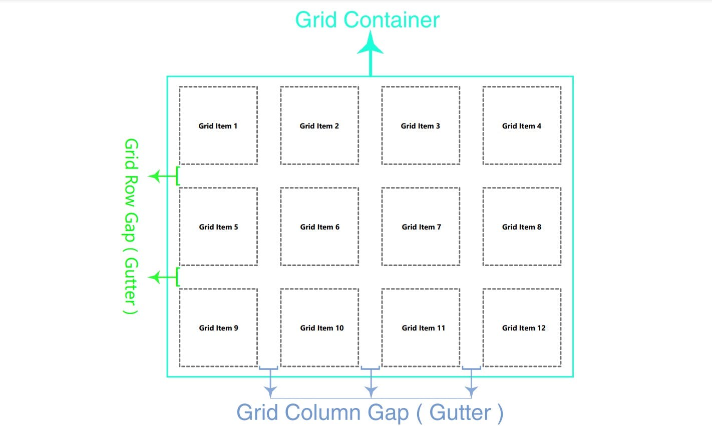
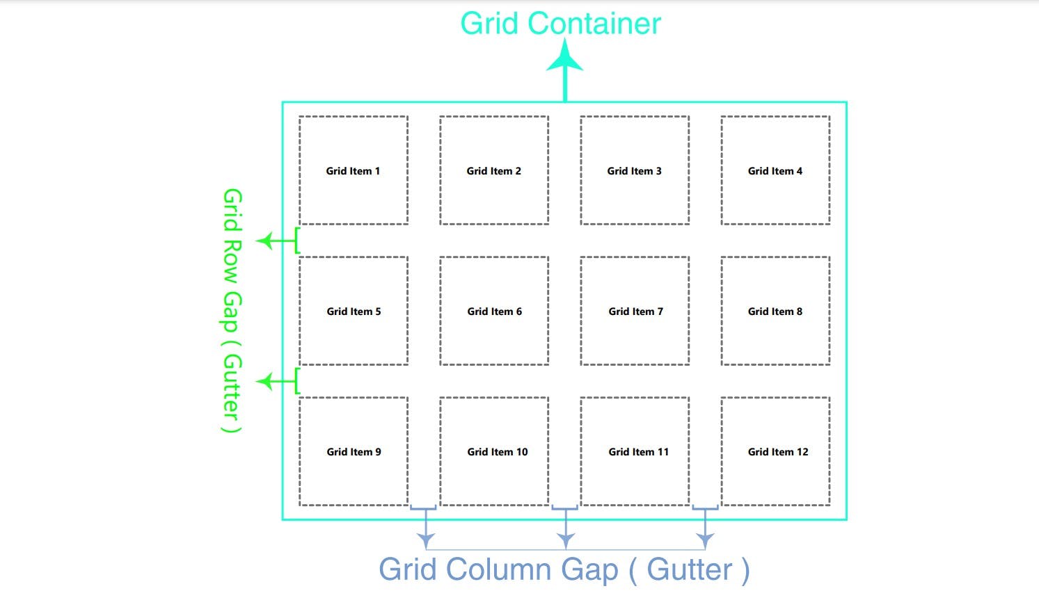
A grid is a collection of horizontal and vertical lines creating a pattern against which we can line up our design elements.


Grid are two dimensional, one is inline(row) axis and second is block(column) axis. When grid comes in picture our lay outing problem is solve because we use for lay out float and flexbox is one dimensional so we not able to lay outing in vertical , we can set item only vertical or horizontal using flexbox.
- A grid have column and rows and between have gap those we know them gutter word.
display:grid;:
Grid is block level grid when we use display grid, we eligible use for get more functionality .We give container to display and those container known name as grid-container and grid container inside have their children is also known as grid-item.
display:inline-grid;:
This display grid is inline level grid.
CSS Grid properties:
Grid have two type properties one for grid-container property and second for grid-item property.
Properties for the Parent(Grid Container):
display, grid-template-columns, grid-template-rows, grid-template-areas, grid-template, grid-column-gap, grid-row-gap, grid-gap, justify-items, align-items, place-items, justify-content, align-content, place-content, grid-auto-columns, grid-auto-rows, grid-auto-flow, grid.
display: Display have two value one isgridand second isinline-grid. grid: It's create block level grid. inline-grid: It's create inline-level grid.
.container{
  display: grid | inline-grid;
}
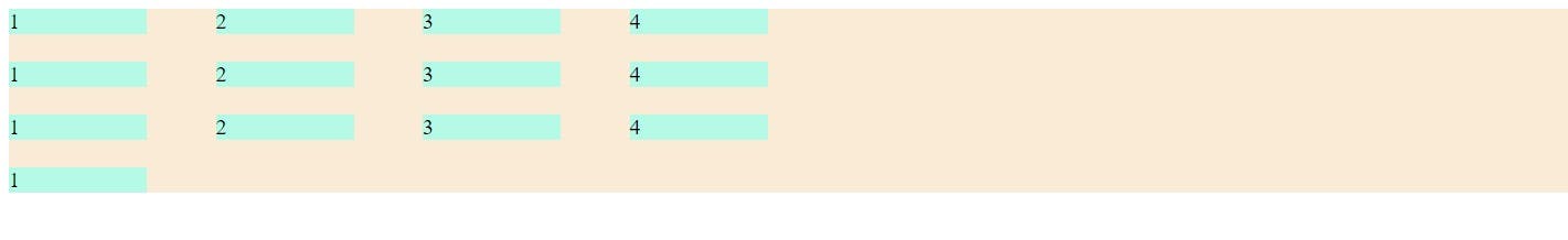
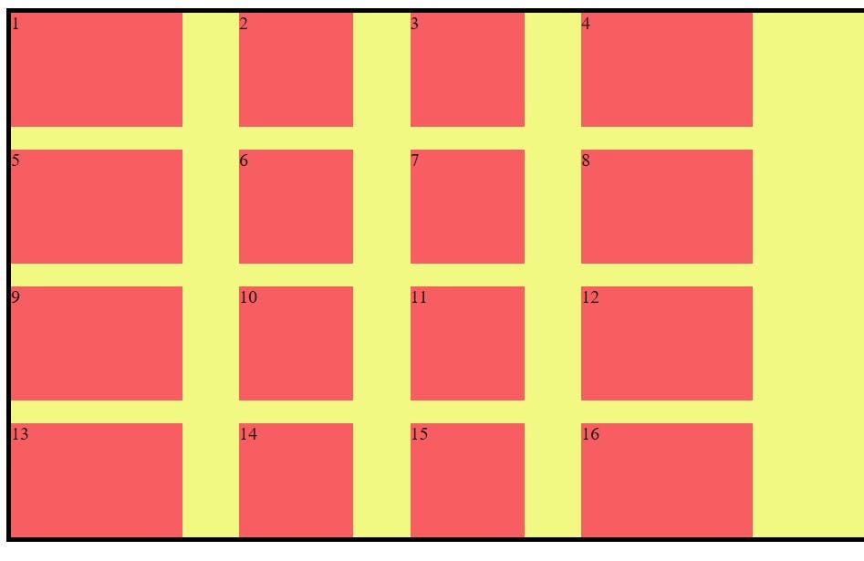
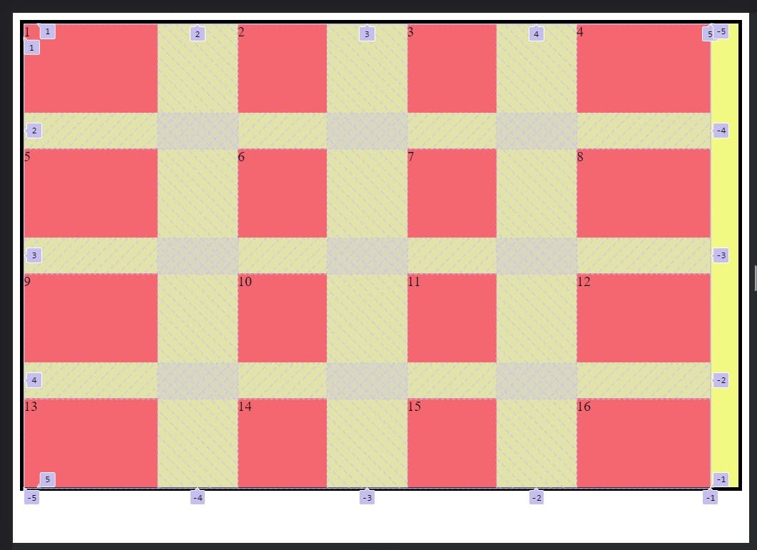
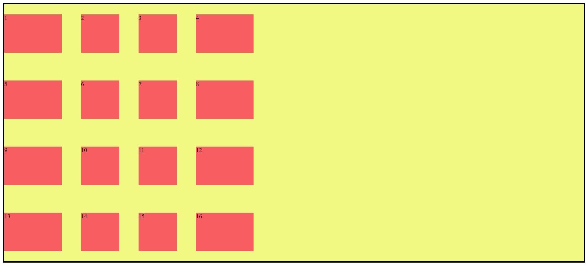
grid-template-columns:
This property divided to grid in column as you as want column. You use many type value unit like as percentage, fr, pixel etc.
CSS Code:
<style>
      .container {
        display: grid;
        grid-template-columns: 100px 100px 100px 100px;

        background-color: antiquewhite;
        gap: 20px 50px;
      }

      .item {
        background-color: rgb(180, 250, 230);
      }
    </style>
HTML Code:
<body>
    <div class="container">
      <div class="item item1">1</div>
      <div class="item item2">2</div>
      <div class="item item3">3</div>
      <div class="item item4">4</div>

      <div class="item item1">1</div>
      <div class="item item2">2</div>
      <div class="item item3">3</div>
      <div class="item item4">4</div>

      <div class="item item1">1</div>
      <div class="item item2">2</div>
      <div class="item item3">3</div>
      <div class="item item4">4</div>

      <div class="item item1">1</div>
    </div>
  </body>
Output:
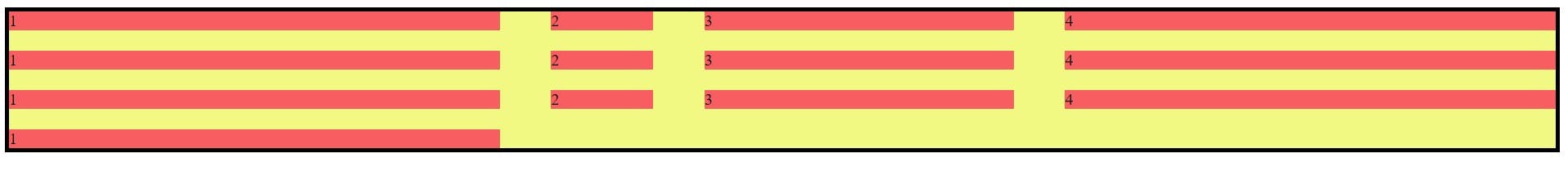
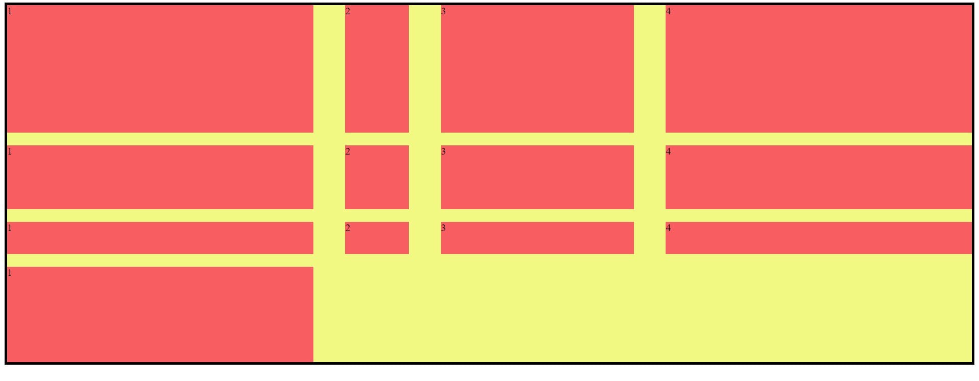
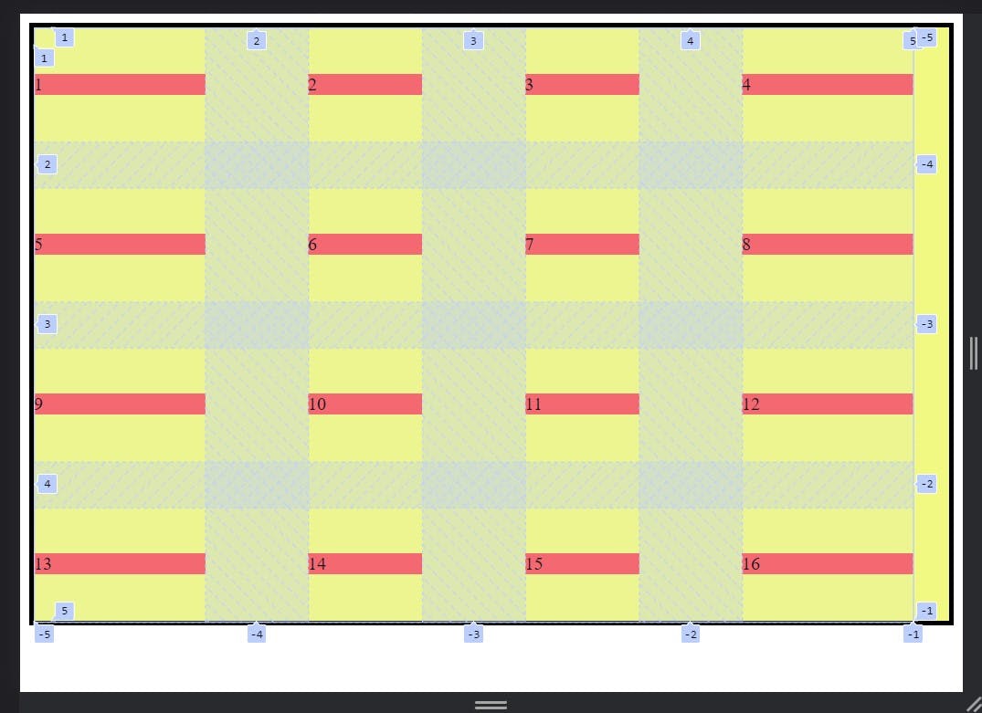
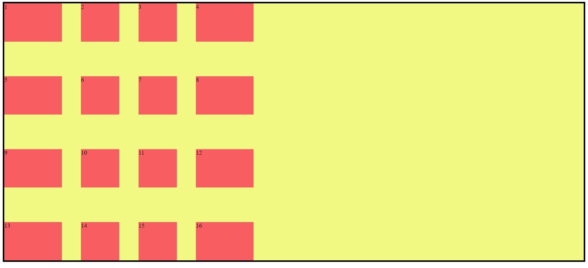
- Using Different Unit:
- CSS Code:
    <style>
      .container {
        display: grid;
        grid-template-columns: 1fr 100px 20% 1fr;

        background-color: rgb(241, 249, 131);
        gap: 20px 50px;
        border: 4px solid black;
      }

      .item {
        background-color: rgba(250, 47, 88, 0.773);
      }
    </style>
- Output:
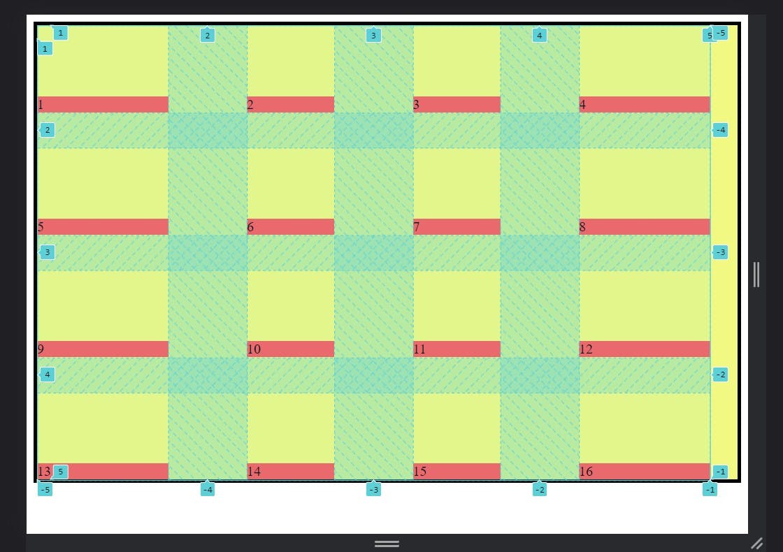
grid-template-rows:
This property create the rows for grid however you want and which type you want size.
- CSS Code:
<style>
      .container {
        display: grid;
        grid-template-columns: 1fr 100px 20% 1fr;
        grid-template-rows: 200px 100px 50px 150px;

        background-color: rgb(241, 249, 131);
        gap: 20px 50px;
        border: 4px solid black;
      }

      .item {
        background-color: rgba(250, 47, 88, 0.773);
      }
    </style>
- Output:
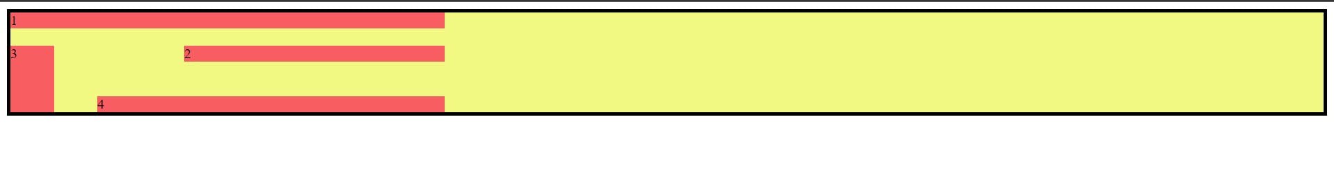
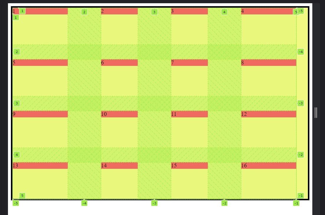
Grid template areas defining the name of grid items which specified thegrid-template-areas:grid-areaproperty. Grid template areas have three value which is given below.
Values:
<grid-area-name>– the name of a grid area specified with grid-area.– a period signifies an empty grid cellnone– no grid areas are definedSyntax:
.container {
  grid-template-areas:
    "<grid-area-name> | . | none | ..."
    "...";
}
- Example:
 <style>
      .item1 {
        grid-area: header;
      }

      .item2 {
        grid-area: main;
      }
      .item3 {
        grid-area: sidebar;
      }
      .item4 {
        grid-area: footer;
      }

      .container {
        display: grid;
        grid-template-columns: 50px 50px 50px 200px;
        grid-template-rows: auto;
        grid-template-areas:
          "header header header header"
          "sidebar . main main"
          "sidebar . . ."
          "sidebar footer footer footer";

        background-color: rgb(241, 249, 131);
        gap: 20px 50px;
        border: 4px solid black;
      }

      .item {
        background-color: rgba(250, 47, 88, 0.773);
      }
    </style>
- Output:
This is the shorthand property ofgrid-template:grid-template-rows,grid-template-columnandgrid-template-areas.
Values:
none- sets all three properties to their initial values<grid-template-rows> / <grid-template-columns>– setsgrid-template-columnsandgrid-template-rowsto the specified values, respectively, and setsgrid-template-areasto none
.container {
  grid-template: none | <grid-template-rows> / <grid-template-columns>;
}
Example:
  <style>

    .container {
      display: grid;

      grid-template: repeat(4, 100px) / 150px 100px 100px 150px;

      background-color: rgb(241, 249, 131);
      gap: 20px 50px;
      border: 4px solid black;
    }

    .item {
      background-color: rgba(250, 47, 88, 0.773);
    }
  </style>
Output:
grid-gap(grid-row-gap, grid-column-gap):
grid-gap is the shorthand property of the grid-row-gap, grid-column-gap.
Syntax:
.container {
  /* standard */
  gap: <grid-row-gap> <grid-column-gap>;

  /* old */
  grid-gap: <grid-row-gap> <grid-column-gap>;
}
place-items(align-items, justify-items):place-itemsis the short hand property of thealign-items,justify-items.align-items: Align-items is the align on block(column) axis to the opposite of the justify items axis.
Values:
start: this is the start from her cell of the top.
end: this is the start from her cell of the bottom.
center: this is the start from her cell in the center.
stretch: this is the stretch in whole cell.
baseline: this is the align from baseline.
.container {
   align-items: start | end | center | stretch | baseline ;
};
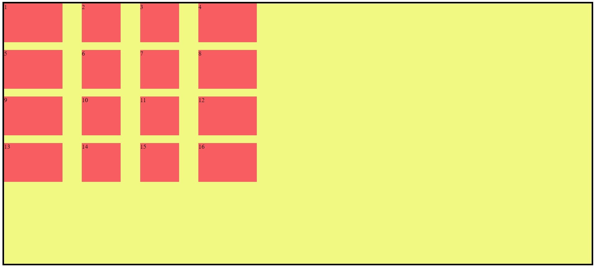
Example:
 <style>
      .container {
        display: grid;

        grid-template: repeat(4, 100px) / 150px 100px 100px 150px;
        gap: 40px 90px;

        align-items: start;

        background-color: rgb(241, 249, 131);
        border: 4px solid black;
      }

      .item {
        background-color: rgba(250, 47, 88, 0.773);
      }
    </style>
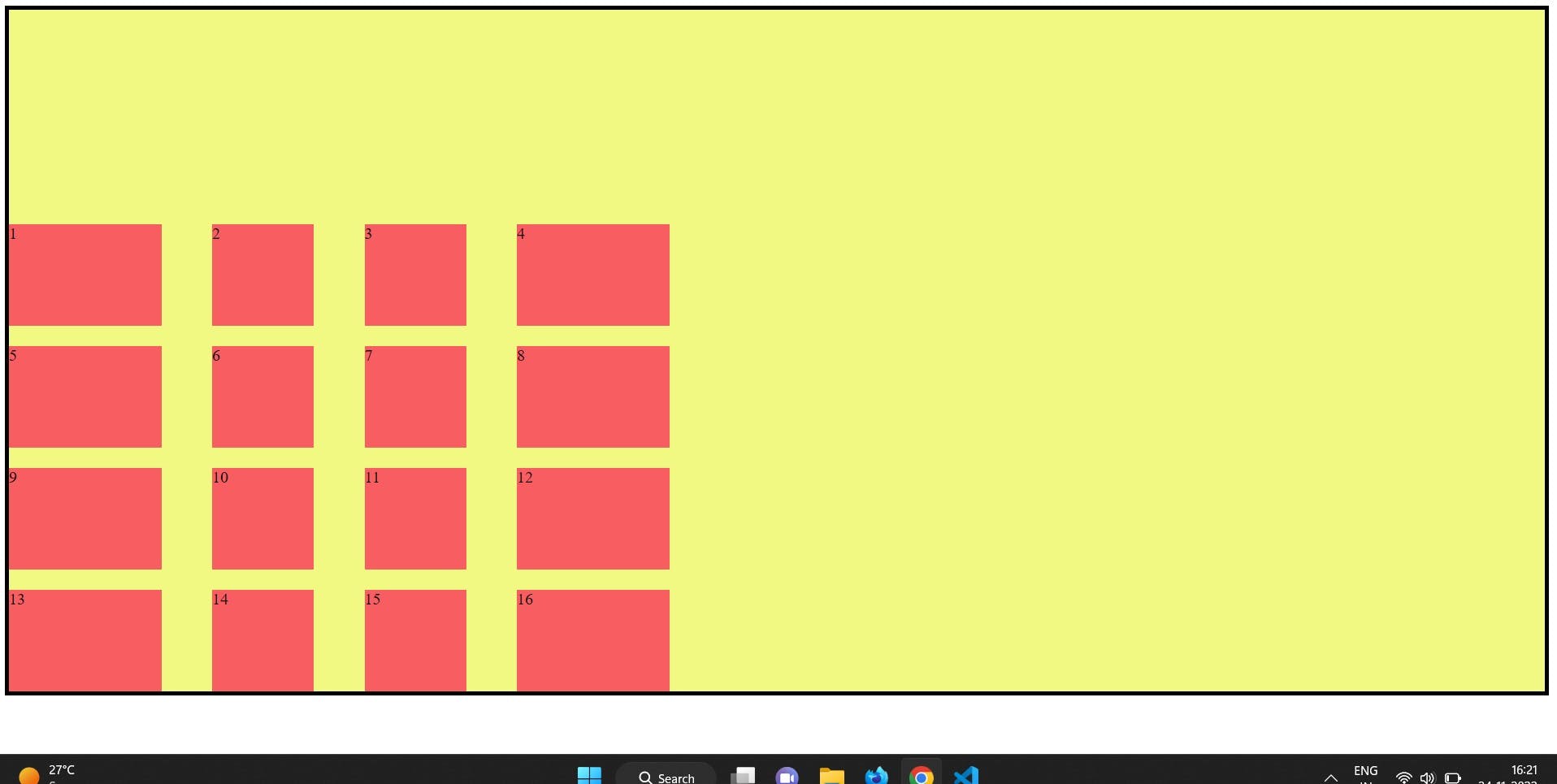
.container {
  align-items: end;
}
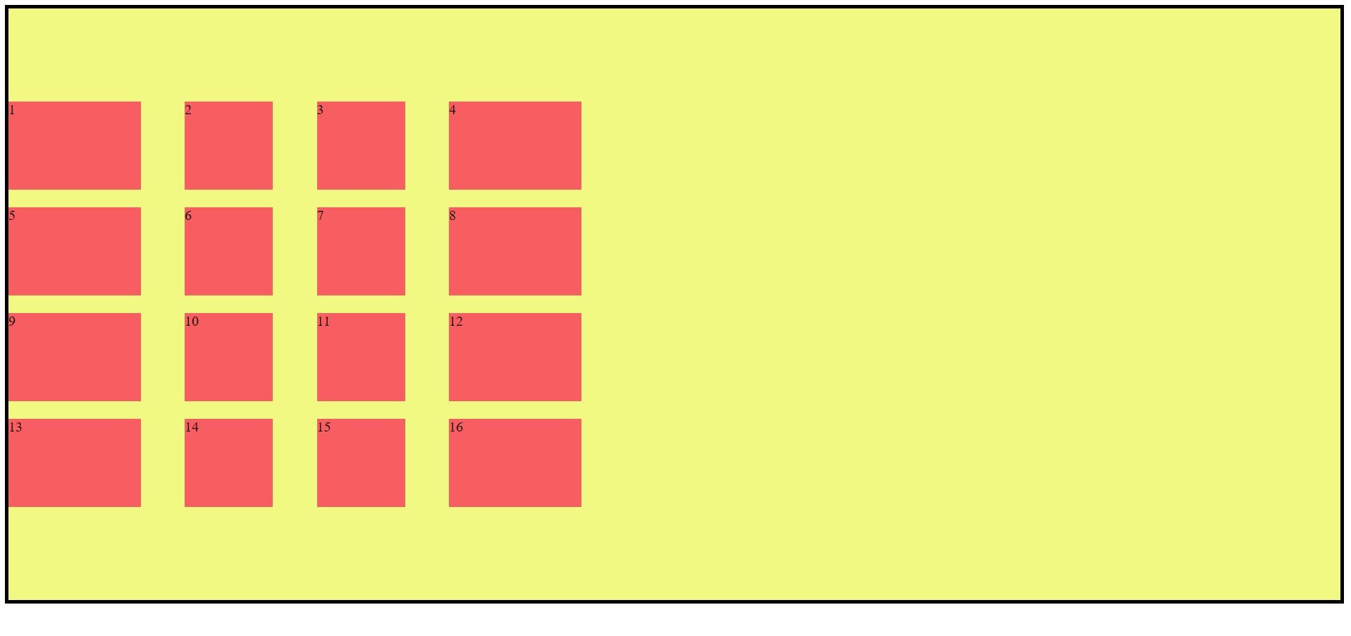
.container {
  align-items: stretch;
}
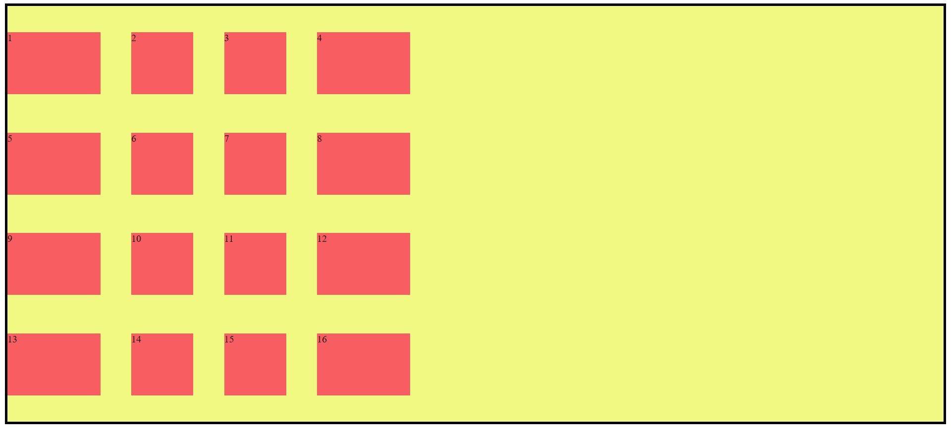
.container {
  align-items: center;
}
.container {
  align-items: baseline;
}
Shorthand Property place-items:
place items have put two value first align-items second justify-items
.container {
  place-items: <align-items> <justify-items>;
}
Place-content(justify-content, align-content):
this is the shorthand property of the both content justify-content align on the row axis and align-content align on the column axis.
.container {
     place-content: <align-content> <justify-content> ;
}
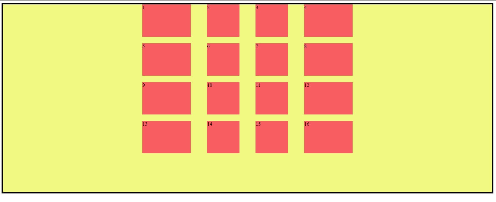
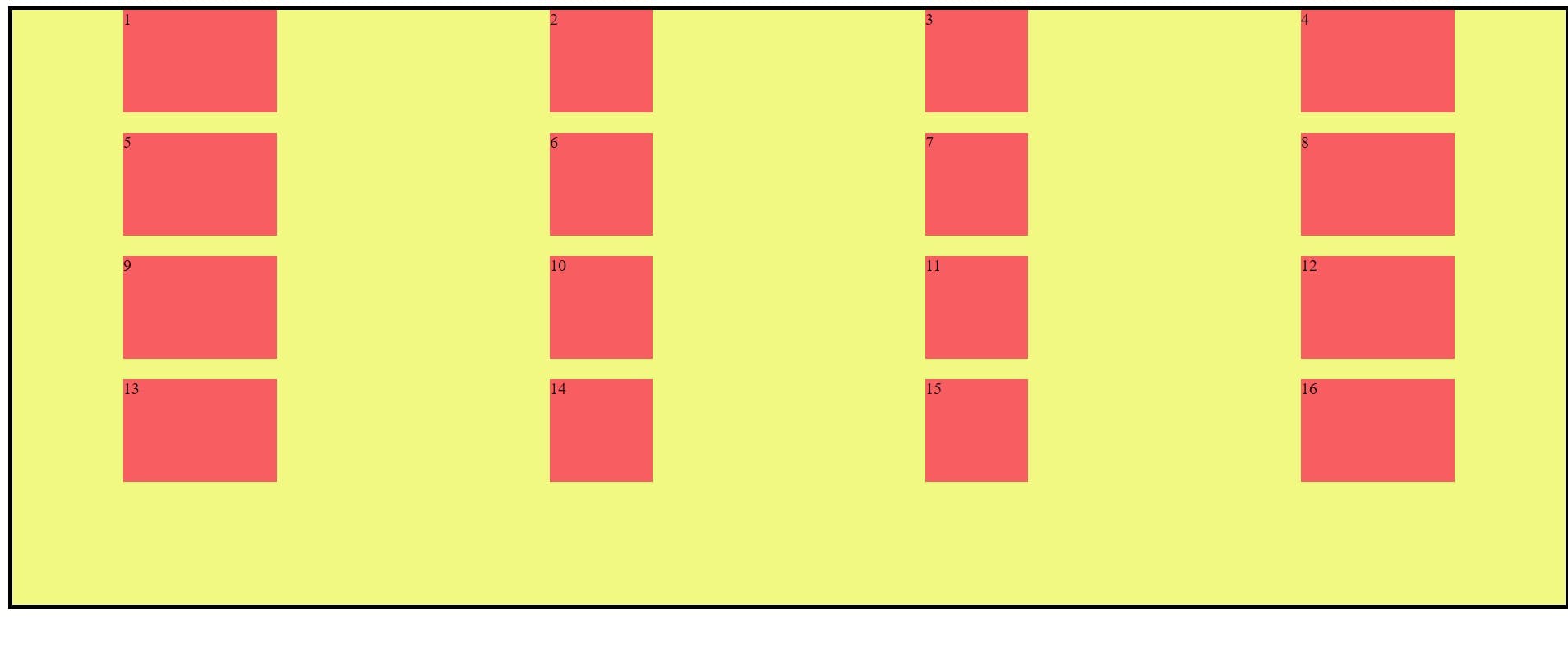
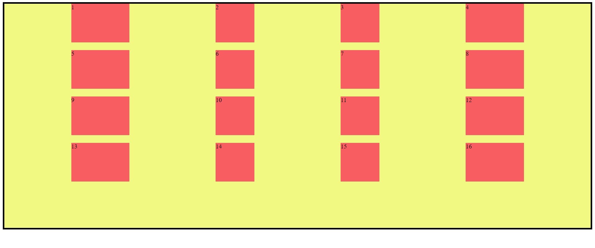
justify-content Example: this is the sit on the row axis and these values are start, end, center, stretch, space-between, space-evenly, space-around.
.container {
     justify-content: start | end | center | stretch |space-between | space-around | space-
       evenly ;
}
Example:
justify-content: start ;
justify-content: end ;
justify-content: stretch ;
justify-content: center ;
justify-content: space-around ;
justify-content: space-between ;
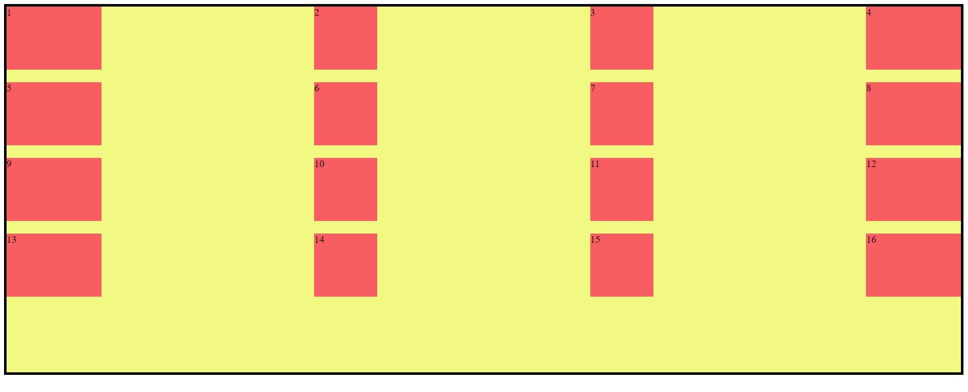
justify-content: space-evenly ;
align-content Example:
this is the sit on the column axis and these values are start, end, center, stretch, space-between, space-evenly, space-around.
.container {
     align-content: start | end | center | stretch |space-between | space-around | space-
       evenly ;
}
Example:
align-content: start ;
align-content: end ;
align-content: stretch ;
align-content: center ;
align-content: space-evenly ;
align-content: space-around ;
align-content: space-between ;
Properties for the Children(Grid Items):
This below property is apply on grid items.
grid-column-start, grid-column-end, grid-row-start, grid-row-end, grid-column, grid-row, grid-area, justify-self, align-self, place-self.
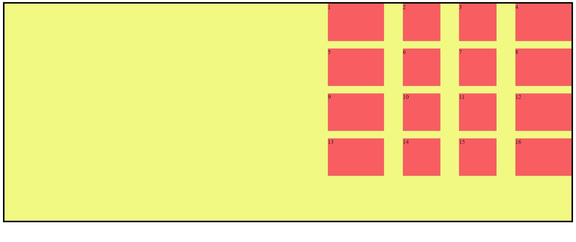
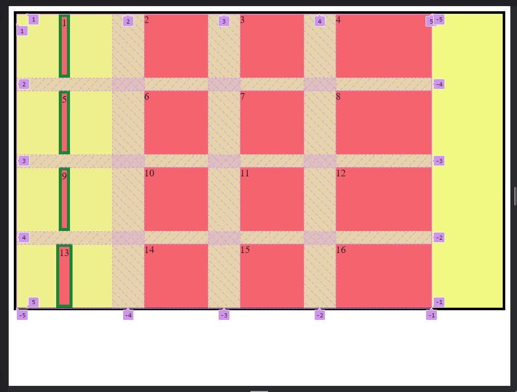
grid-column-start, grid-column-end, grid-row-start, grid-row-end:
grid-column-start/grid-row-start is where the item will start and grid-column-end/grid-row-end where is the item end.
Syntax:
    <style>

      .container {
        display: grid;

        grid-template: repeat(4, 100px) / 150px 100px 100px 150px;
        gap: 20px 50px;

       background-color: rgb(241, 249, 131);
        border: 4px solid black;
      }

      .item {
        background-color: rgba(250, 47, 88, 0.773);
      }

      .item1 {
        grid-column-start: 1;
        grid-column-end: 5;
        grid-row-start: 1;
        grid-row-end: 3;
      }
    </style>
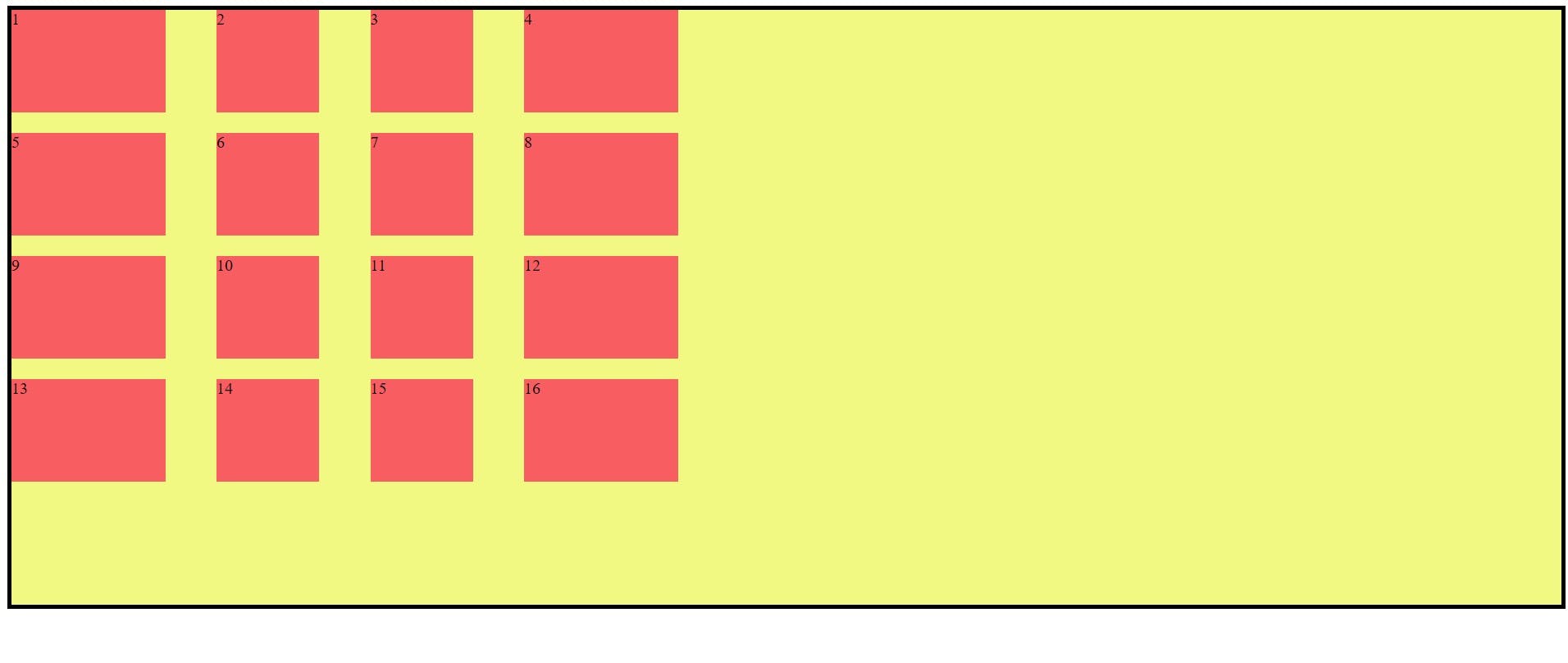
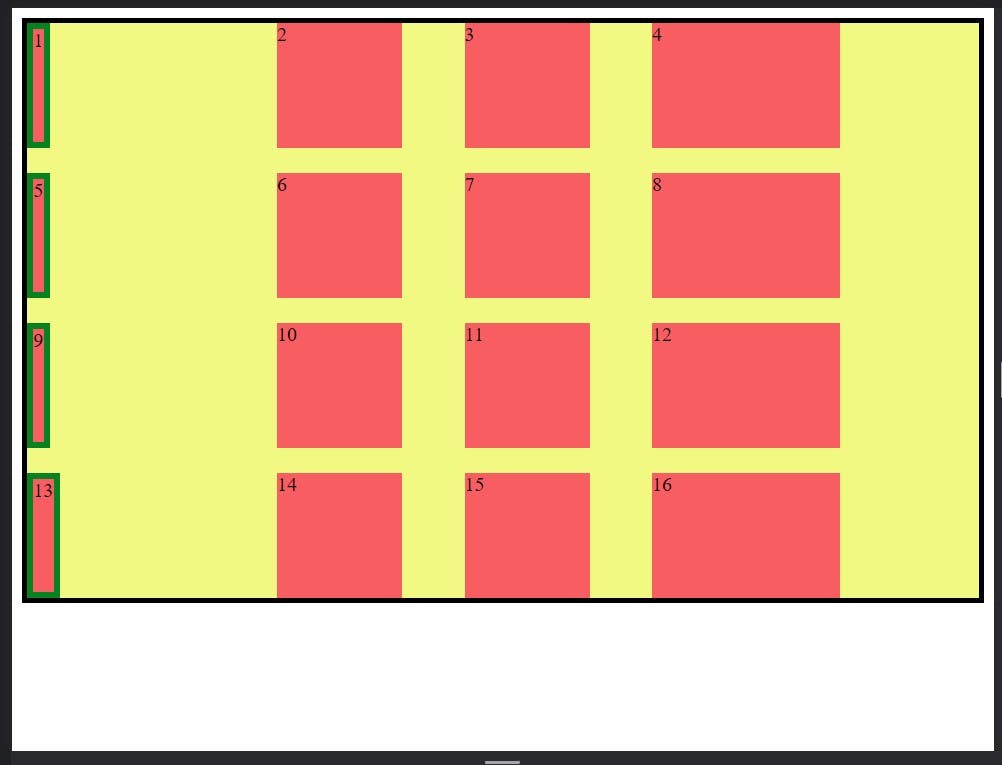
grid-column and grid-row:
grid-column and grid-row is shorthand property of the grid-column-start, grid-column-end, grid-row-start and grid-row-end.
    <style>

      .container {
        display: grid;

        grid-template: repeat(4, 100px) / 150px 100px 100px 150px;
        gap: 20px 50px;

        background-color: rgb(241, 249, 131);
        border: 4px solid black;
      }

      .item {
        background-color: rgba(250, 47, 88, 0.773);
      }

      .item1 {
        /* grid-column-start: 1;
        grid-column-end: 5;
        grid-row-start: 1;
        grid-row-end: 3; */

        grid-column: 1/-1;
        grid-row: 1/3;
      }
    </style>
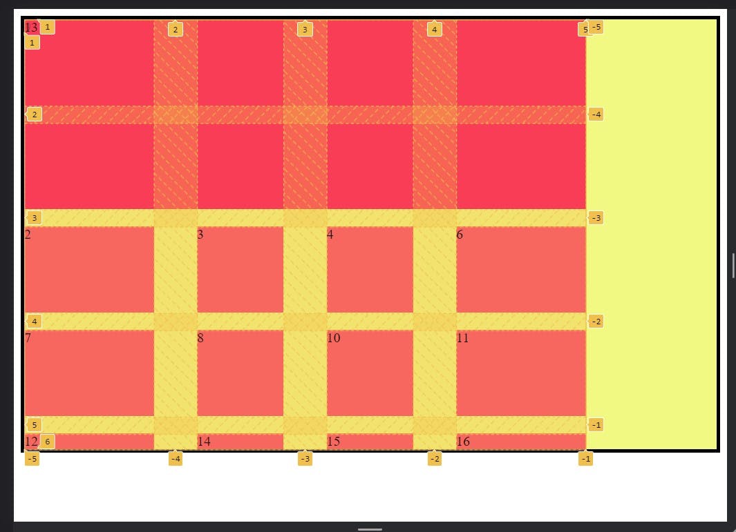
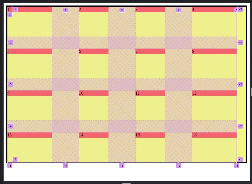
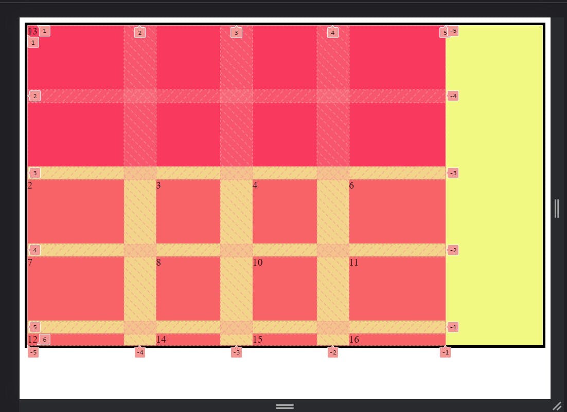
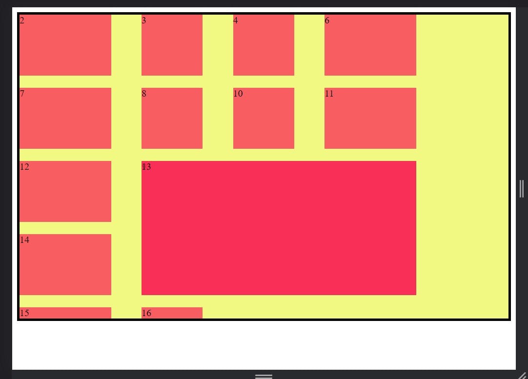
grid-area:
This is the shorter shorthand property of the grid-row-start + grid-column-start + grid-row-end + grid-column-end.
Syntax:
.item1{
   grid-area: <grid-row-start> / <grid-column-start > / <grid-row-end> / <grid-column-end>;
}
Example:
 <style>

      .container {
        display: grid;

        grid-template: repeat(4, 100px) / 150px 100px 100px 150px;
        gap: 20px 50px;

        background-color: rgb(241, 249, 131);
        border: 4px solid black;
      }

      .item {
        background-color: rgba(250, 47, 88, 0.773);
      }

      .item1 {
        /* grid-column-start: 1;*/
             /*grid-column-end: 5;*/
                /*grid-row-start: 1;*/
               /* grid-row-end: 3; */

           /*Shorthand property*/
            /* grid-column: 1/-1;*/
            /*grid-row: 1/3;*/

         /*Shorter shorthand property*/
         grid-area: -1 / -4 / -3 / -1;
      }
    </style>
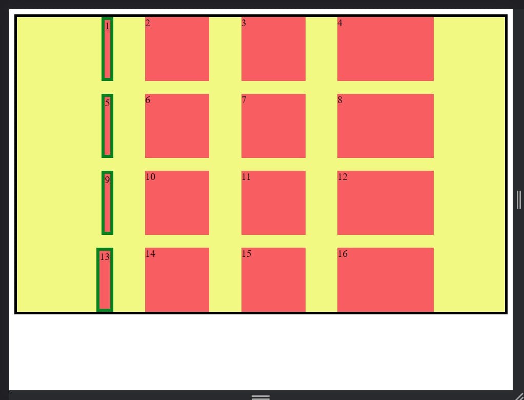
place-self is the shorthand property of theplace-self(justify-self,align-self):justify-selfandalign-self.
Syntax:
.item1 {
  place-self: <align-self> / <justify-self>;
}
Example:
  .item1 {
        border: 5px solid rgb(4, 131, 33);

        place-self: start stretch;
      }

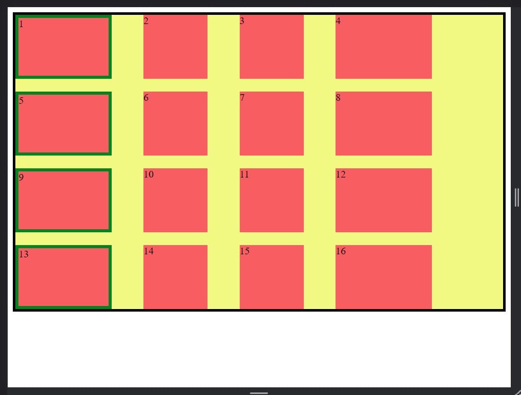
justify-self:
This property apply on grid items and this set the value on row axis.
Syntax:
.item {
justify-self: start | end | center | stretch;
}
Example:
  .item1 {
        border: 5px solid rgb(4, 131, 33);

       justify-self: center;
      }
  .item1 {
        border: 5px solid rgb(4, 131, 33);

       justify-self: start;
      }
  .item1 {
        border: 5px solid rgb(4, 131, 33);

       justify-self: end;
      }
  .item1 {
        border: 5px solid rgb(4, 131, 33);

       justify-self: stretch;
      }
- If you want read more about CSS Grid Go these links :- css tricks and mdn docs.